Start with the mechanism
Understand the failure before changing CSS
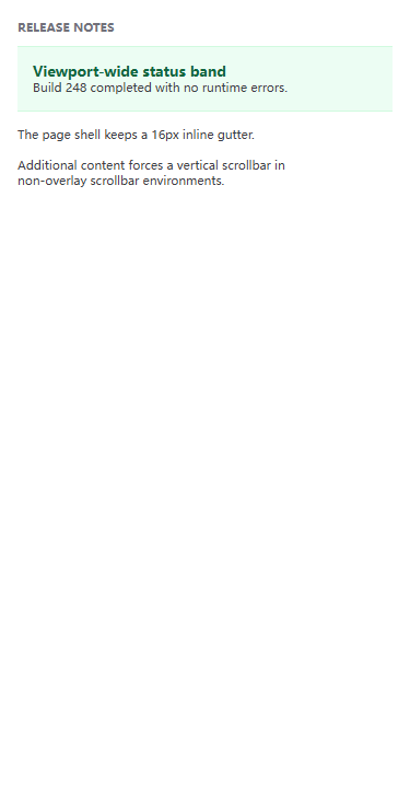
Horizontal scrolling is not one bug. A page can become wider because a viewport-sized child ignores space already consumed by its parent, an unbroken string contributes a large minimum width, or a media and data region escapes its intended boundary. The visible symptom is similar, but each mechanism needs a different correction.
Start by separating page-level overflow from an intentional local exception. The document should normally fit its viewport at 320 CSS pixels. A code block, table, or other genuinely two-dimensional region may scroll inside a labeled container, provided that surrounding headings, controls, and prose still reflow and the complete content remains reachable.
Decision routes
Choose the route that matches the measured signal
These branches describe different ownership boundaries. Follow the signal that matches the page, then open the linked fixture to compare a controlled failure with its smallest verified correction.
Viewport-sized child inside a constrained parent
- Visible signal
- The overflowing element uses 100vw even though padding, a sidebar, or another wrapper already consumes inline space.
- Likely mechanism
- Viewport units describe the viewport, not the remaining content box. The child therefore adds its full viewport width inside a smaller parent.
- Next measurement
- Compare the element right edge with its containing block. If it should fill the parent, test a percentage or container-relative inline size.
Continuous text or preserved formatting
- Visible signal
- A URL, identifier, filename, command, or preformatted line stays on one line and widens the page.
- Likely mechanism
- The content contributes a min-content width larger than the available line. Normal wrapping either has no opportunity or is intentionally disabled.
- Next measurement
- Choose by content semantics: add safe text wrap opportunities for prose, or keep preserved output inside a keyboard-reachable local scroll region.
Fixed-size media or embedded content
- Visible signal
- An image or iframe retains authored desktop dimensions inside a narrower article.
- Likely mechanism
- The replaced element has an intrinsic or explicit inline size that is not capped by the available container width.
- Next measurement
- Preserve the intrinsic aspect ratio while constraining the inline size. Recheck the embedded document separately from its outer frame.
Data genuinely needs two-dimensional space
- Visible signal
- Compressing a table would destroy useful row and column relationships, but leaving it unconstrained makes the whole article pan sideways.
- Likely mechanism
- The table minimum width participates in the document scrollable area because its wrapper allows overflow to remain visible.
- Next measurement
- Keep the semantic table and move horizontal scrolling to a labeled, focusable region whose maximum inline size is the article width.
Numbers before conclusions
Measurement reference
Use the same measurements before and after a change. A fix is credible when it improves the intended boundary without making content or controls less reachable.
Compare documentElement.scrollWidth with documentElement.clientWidth after the page reaches its stable state.
The difference is zero at each supported narrow viewport unless the product explicitly requires document panning.
Inspect bounding rectangles from the deepest overflowing candidate through its containing-block ancestors.
Every ordinary content edge stays within its owner; the first exception is explained by a deliberate component contract.
Focus the scroll region, move to its inline end with keyboard input, and compare scrollWidth with clientWidth.
The complete code or data remains reachable, focus is visible, and the surrounding document does not move sideways.
Repeatable method
Inspection workflow
- 01
Prove that the document is wider
Compare documentElement.scrollWidth with documentElement.clientWidth at 320 and 375 CSS pixels. Do not infer page overflow from a scrollbar inside one component.
Keep: Record both widths and the positive difference before changing CSS.
- 02
Find the first boundary crossing
Inspect element bounding rectangles and locate an element whose right edge exceeds the document client width. Then inspect its ancestors before editing the element itself.
Keep: Save the responsible selector, element rect, and containing-block width.
- 03
Classify the content contract
Decide whether the content should wrap, scale, shrink, or remain wider inside a local scroll region. This decision comes from meaning, not from whichever CSS rule removes the scrollbar fastest.
Keep: State which content must remain visible and which relationship must be preserved.
- 04
Apply the narrowest correction
Change the boundary or content policy at the component that owns the problem. Avoid global clipping rules that can conceal unrelated defects.
Keep: Keep an exact before-and-after diff and a reproducible failing fixture.
- 05
Retest page and local reachability
Confirm zero page overflow at target widths. If a local scroller remains, verify keyboard focus, visible focus indication, and access to its final content.
Keep: Record document overflow and local clientWidth, scrollWidth, focus result, and representative screenshots.
What controlled fixtures reveal
Field notes
These details are easy to miss when a page is checked at only one width or with idealized content. They turn the guide into a repeatable review rather than a one-off patch.
Inspect logical sizes first
Physical width rules can hide the ownership problem when the component also supports vertical writing or bidirectional content.
Apply: Read inline-size, min-inline-size, padding, and overflow together before introducing another width override.
Use hostile but meaningful content
Short demo text rarely exposes a long URL, build hash, translated label, or wide data relationship.
Apply: Keep one realistic extreme value in the regression fixture and explain why it must wrap, scale, or scroll.
Name every scrolling owner
Nested anonymous scrollers make wheel, touch, and keyboard behavior difficult to predict and test.
Apply: Limit scrolling to the component that needs it, give that region an accessible name, and retain a visible focus state.
Do not trade one defect for another
Common misfixes
Apply overflow-x: hidden to the page
The scrollbar disappears, but content and focus indicators can still exist outside the visible boundary. The underlying sizing error remains.
Use instead: Measure the element that crosses the boundary and correct its width, wrapping, or local overflow contract.
Force every string to break anywhere
Global aggressive breaking can damage code, identifiers, data, and ordinary reading without addressing fixed media or container sizing.
Use instead: Use wrapping only for prose-like content. Preserve meaningful single-line output in a local scroll region.
Add max-width: 100% without checking the owner
The rule can help replaced elements but does not repair viewport units, intrinsic flex or grid minimums, negative margins, or transformed content.
Use instead: Identify the mechanism first, then place the constraint on the element or wrapper that owns it.
Before publishing the component
Release checks
- The document has zero horizontal overflow at 320 and 375 CSS pixels.
- Text remains readable without two-dimensional page panning at 200% zoom.
- Images and embedded frames preserve a valid aspect ratio.
- Any local horizontal scroller is labeled, focusable, and exposes all content.
- No global clipping rule hides focus rings or off-screen controls.
- The regression records the failing mechanism as well as the fixed outcome.
Project-owned fixtures
Verified Overflow & Reflow cases
Each case includes a failing and fixed fixture, exact CSS or script diff, current-browser measurements, and a three-browser evidence manifest.
Why `100vw` Can Create Horizontal Scrolling
A viewport-wide child ignores the inline space already consumed by its padded page container and makes the document wider than the visible area.
Fix Long URLs and Unbroken Text Without Hiding Overflow
A continuous identifier has no normal wrapping opportunity, so its line box extends beyond a narrow article and widens the page.
Keep Code Blocks Scrollable Without Widening the Page
A preformatted command preserves one long line and lets its overflow escape into the document instead of remaining inside the code region.
Stop Fixed-Size Images From Breaking Mobile Layouts
A 640-pixel image keeps its authored width inside a narrower article, forcing the document wider even though its intrinsic aspect ratio is valid.
Make Fixed-Size Iframes Fit Narrow Containers
A 640 by 360 iframe preserves its authored desktop dimensions inside a narrower article, producing page-level overflow instead of scaling as a bounded 16:9 region.
Keep Wide Tables Scrollable Without Breaking Page Reflow
A semantic comparison table needs two-dimensional space, but allowing its 640-pixel width to escape the article makes unrelated text scroll horizontally too.
Source boundary
Primary references used by these cases
The guide summarizes project measurements. Normative behavior and accessibility requirements remain linked to the primary sources reviewed for each case.
- CSS Values and Units Module Level 4 - viewport-percentage lengthsW3C · checked 2026-08-04
- CSS Overflow Module Level 3W3C · checked 2026-08-04
- CSS Text Module Level 4 - overflow-wrapW3C · checked 2026-08-04
- Understanding Success Criterion 1.4.10: ReflowW3C Web Accessibility Initiative · checked 2026-08-04
- HTML Standard - the img elementWHATWG · checked 2026-08-04
- HTML Standard - the iframe elementWHATWG · checked 2026-08-04
- CSS Box Sizing Module Level 4 - preferred aspect ratiosW3C · checked 2026-08-04
- Understanding Success Criterion 1.3.1: Info and RelationshipsW3C Web Accessibility Initiative · checked 2026-08-04