Verified responsive case directory
Responsive Layout Lab
Find a reproduced layout failure, inspect the measured cause, and compare the smallest working fix.
Recently completed
Latest verified cases
Layout Shift
Add a Cookie Banner Without Shifting or Obscuring Content
Layout Shift
Reserve Stable Space for Ads and Third-Party Embeds
Layout Shift
Measure and Reduce Layout Shift From Web Font Substitution
Layout Shift
Prevent Image Layout Shifts With Width and Height
Mobile Viewports & Overlays
Choose Viewport Height Units Without Hiding Mobile Content
Mobile Viewports & Overlays
Stop Fixed Bottom Banners From Covering Focused Content
Featured
Case entry routes
All verified cases
Search by visible symptom or CSS mechanism
15 verified cases in the directory.
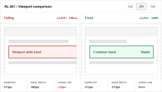
Why `100vw` Can Create Horizontal Scrolling
A viewport-wide child ignores the inline space already consumed by its padded page container and makes the document wider than the visible area.
Open labWhy Flex Items Refuse to Shrink: `min-width: auto`
A flex item keeps a content-based automatic minimum size and forces a row wider than a narrow viewport even when shrinking is enabled.
Open lab`1fr` vs `minmax(0, 1fr)`: Prevent Grid Overflow
A flexible grid track keeps an automatic minimum based on long content and expands beyond the available inline size.
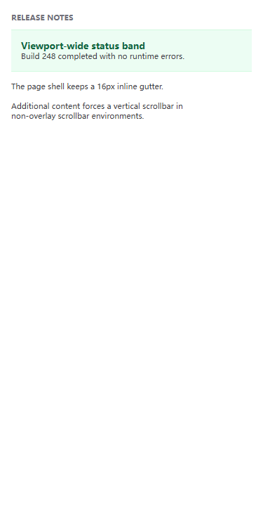
Open labFix Long URLs and Unbroken Text Without Hiding Overflow
A continuous identifier has no normal wrapping opportunity, so its line box extends beyond a narrow article and widens the page.
Open labKeep Code Blocks Scrollable Without Widening the Page
A preformatted command preserves one long line and lets its overflow escape into the document instead of remaining inside the code region.
Open labStop Fixed-Size Images From Breaking Mobile Layouts
A 640-pixel image keeps its authored width inside a narrower article, forcing the document wider even though its intrinsic aspect ratio is valid.
Open labMake Fixed-Size Iframes Fit Narrow Containers
A 640 by 360 iframe preserves its authored desktop dimensions inside a narrower article, producing page-level overflow instead of scaling as a bounded 16:9 region.
Open labKeep Wide Tables Scrollable Without Breaking Page Reflow
A semantic comparison table needs two-dimensional space, but allowing its 640-pixel width to escape the article makes unrelated text scroll horizontally too.
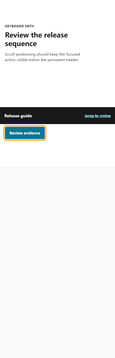
Open labPrevent Sticky Headers From Hiding Anchor Targets
A sticky 56-pixel header covers a focused jump target after scroll positioning, so keyboard users cannot see the control or its focus indicator.
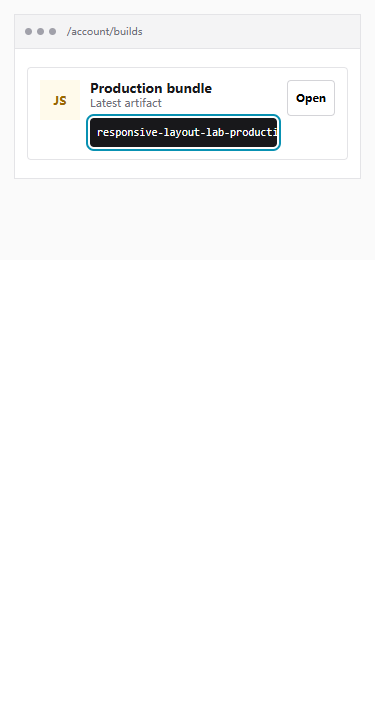
Open labStop Fixed Bottom Banners From Covering Focused Content
A persistent 72-pixel bottom banner covers the final focused action after end-aligned scrolling, leaving the control and its focus indicator unavailable to keyboard users.
Open labChoose Viewport Height Units Without Hiding Mobile Content
A full-height shell sized to a larger viewport can extend 56 pixels below the currently visible area when browser controls occupy part of the screen.
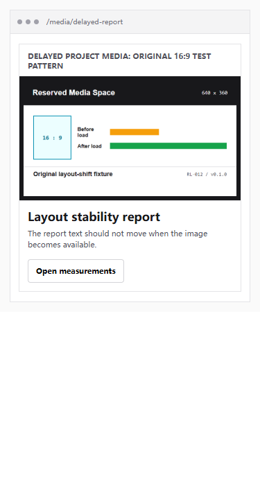
Open labPrevent Image Layout Shifts With Width and Height
A project-owned image receives its source after initial layout; without dimensions the following content moves when the image becomes available, while width and height reserve its aspect ratio in advance.
Open labMeasure and Reduce Layout Shift From Web Font Substitution
A deterministic system-font model isolates the geometry change caused by swapping fonts with different metrics, then compares it with making the final face available before the first measured layout.
Open labReserve Stable Space for Ads and Third-Party Embeds
A project-authored delayed panel shows how inserting unknown content into a zero-height slot moves the article below it, while an initial minimum height preserves layout.
Open labAdd a Cookie Banner Without Shifting or Obscuring Content
A project-authored consent notice compares unreserved insertion with a stable region, then verifies that keyboard dismissal removes the notice and returns focus to the prior control.
Open labMechanism guides
Follow a diagnostic guide before changing CSS
Overflow & Reflow
Horizontal scrolling, long content, media, and data that cross an intended boundary.
Flexbox & Grid
Intrinsic sizing, flexible tracks, and items that refuse to shrink.
Mobile Viewports & Overlays
Dynamic viewport height, sticky headers, and fixed content overlap.
Layout Shift
Images, fonts, ads, and late content that move an already rendered page.
Local-first tools
Inspect boundaries and compare exact viewports
Overflow Inspector
Classify page-boundary risks and intentional local scrolling.
Viewport Reflow Tester
Switch all verified failing and fixed fixtures at controlled CSS widths.